Fonts, text and layout
Leave room for the Spanish explanation.
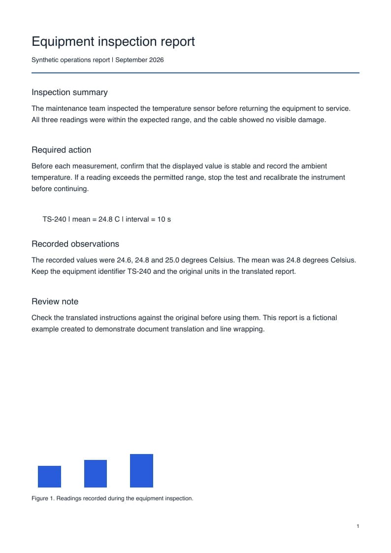
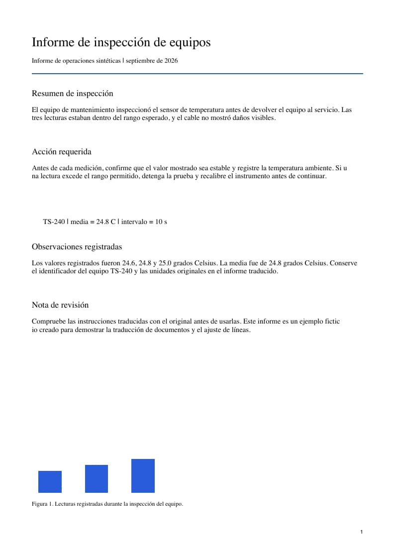
Spanish wording can occupy a different amount of space from its English source, particularly in instructions and formal reports. A fixed PDF text box does not automatically grow with the sentence. Inspect the actual output for wrapping, spacing, and the relationship between labels and figures. This example exposes the result of a real translation rather than promising the same outcome for every document.
Inspect longer sentences in tight spaces
A short English heading or instruction can become a longer Spanish phrase. Narrow table columns, callout boxes, and captions deserve attention after processing. Look for crowded paragraphs, text placed too near a chart, and wording that wraps into an unexpected line. Compare the required-action paragraph in the sample PDFs to see how that particular translation fits its available space.
Check accents, punctuation and numerical conventions
Spanish needs accented letters and the character ñ, which must display correctly in the output font. Review questions, exclamations, percentages, and measurements alongside the source. Number formatting in your document may follow a regional convention that the translated text does not consistently preserve. Match dates, decimal values, identifiers, and units to the English original before sharing the report.
Review terminology for the intended reader
The language selector provides Spanish without a separate Spain or Latin America option. Terminology can vary by region and subject, so review important terms for the audience who will use the document. Both versions gives you a Spanish reading copy and a side-by-side copy for that review. It does not turn a machine-generated document into a certified translation or guarantee a particular regional vocabulary.