Fonts, text and layout
Chinese text needs its own space and typeface.
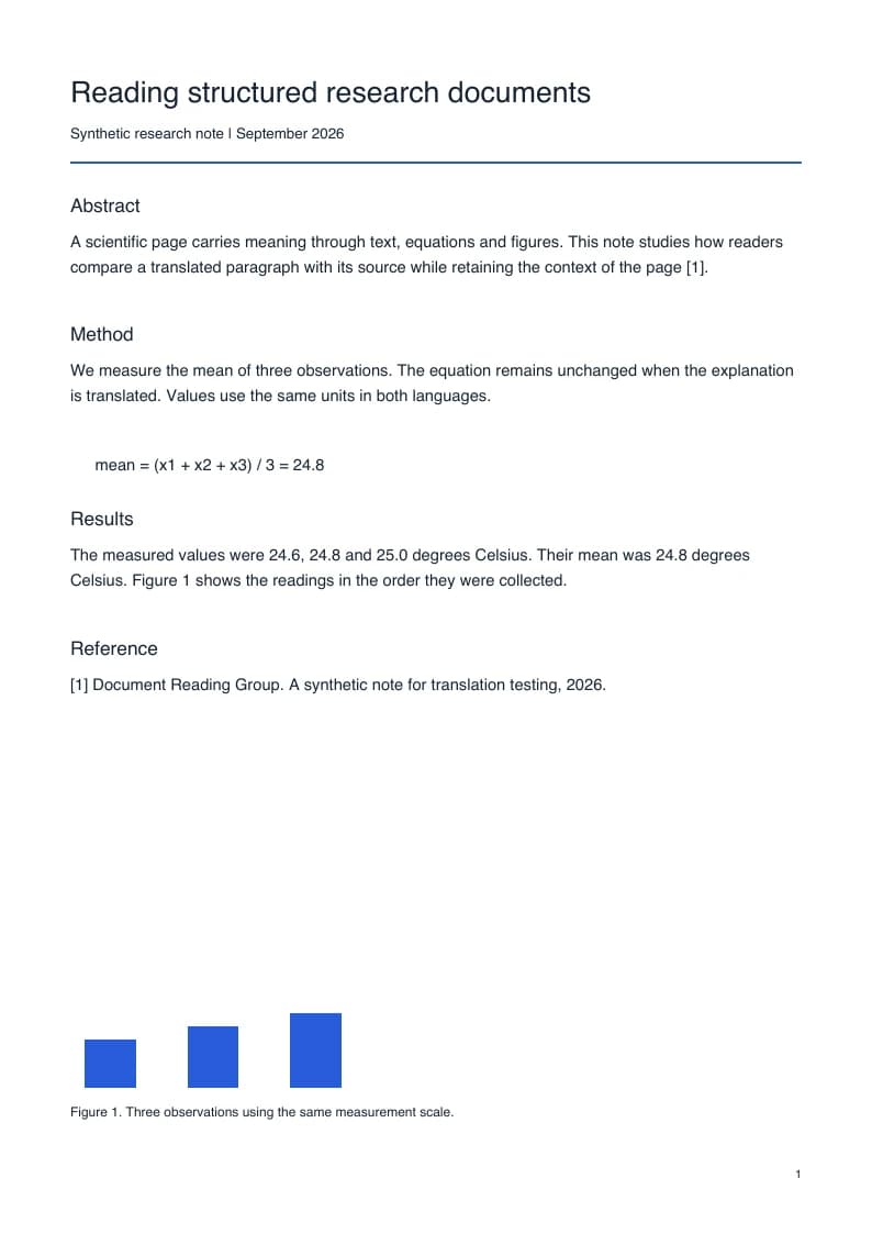
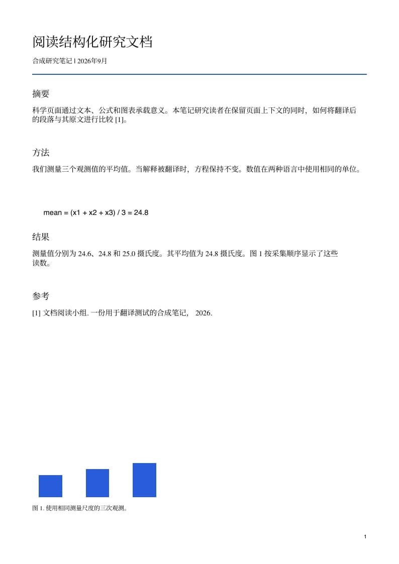
An English PDF often relies on fonts that contain no Chinese characters. Replacing words alone is not enough: the translated page needs a font with the right glyphs, sensible line breaks, and space for the new text. The example above lets you inspect those choices in an actual file instead of judging a recreated preview.
Simplified Chinese is selected
This page starts with English as the source and Chinese (Simplified) as the target. Choose Chinese (Traditional) in the language selector if that is what your readers need. These are different output choices; review names and regional terminology after changing the target. The source language can also be switched to Detect language when a document contains more than one language.
Review font substitution and line breaks
Chinese output uses a typeface that can display the translated characters. It may differ from the English source font, and headings or paragraphs can wrap differently. Inspect punctuation, small characters, and text inside narrow table cells in the downloaded PDF. A readable Chinese page matters more than matching the exact English font metrics; the original remains available for comparison.
Keep formulas and terms easy to check
Research papers combine prose with symbols, variables, units, and citation markers. The translation workflow aims to retain those parts while translating the explanation around them. Use Both versions to receive a reading copy and a side-by-side copy. Compare unfamiliar technical terms, figure labels, and references with the English page before quoting the translated wording in your own work.